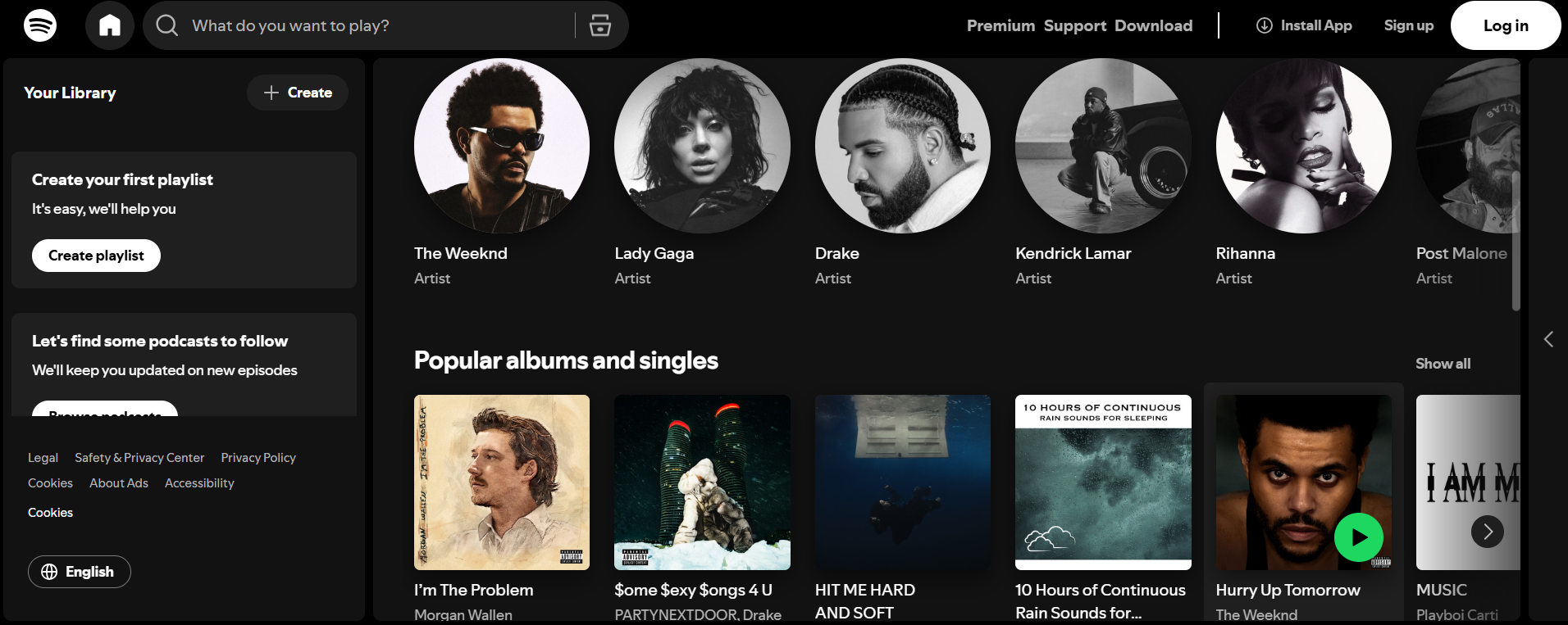
UX Research Method 2
Spotify Research Project

The Research Question
For UX Research Methods II, my team studied how effective Spotify actually is at what it claims to do best: helping you find music you didn't know you wanted.
We framed it around three questions. What behaviours define the music discovery journey? Where does trust in the algorithm turn into frustration? And which features get in the way of the core experience?
We ran mixed methods. Seven high-frequency users completed a quantitative survey using Likert scales and multiple choice, aimed at measuring satisfaction and spotting trends. Five more sat for semi-structured in-depth interviews, aimed at the emotions and motivations behind the numbers. Every participant completed a usability test first, so they were responding to a recent experience rather than a general impression.
What We Found
The survey pointed in one clear direction. Just over 71% relied on search and browse as their primary way to find music — and the same group rated Spotify's playlists highly. Podcasts, charts, and radio ranked as the least useful features by a wide margin.
The interviews explained why those two things weren't a contradiction. Users genuinely trust the algorithm — one described Discover Weekly as feeling like it knows them. But the same people ran into its limits: recommendations that circle back to what they already have, with one participant asking for the occasional wild card. And on non-music features, the verdict was blunt. One participant said they open Spotify for music, not podcasts.
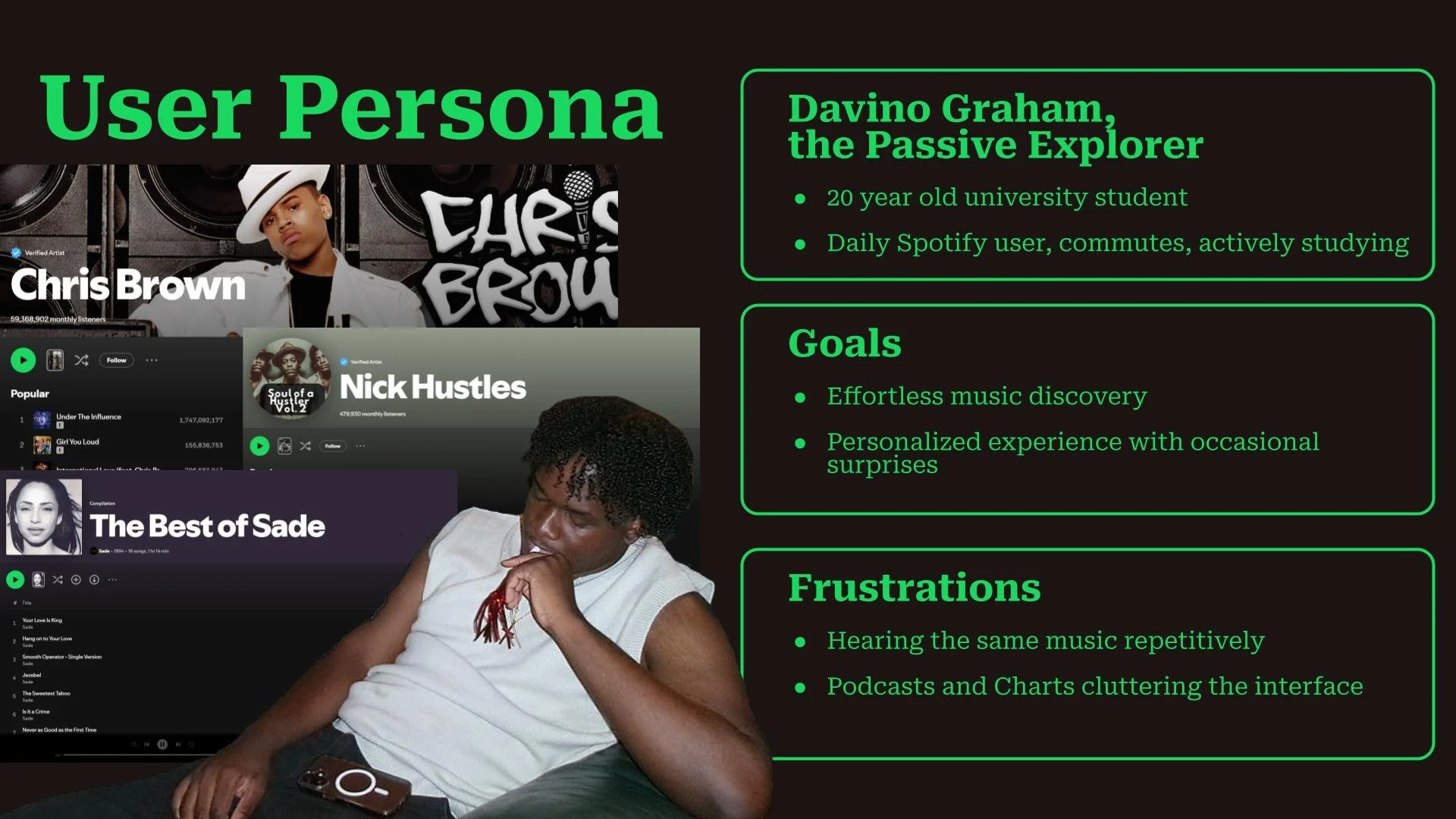
We synthesized this into a persona — Davino Graham, the Passive Explorer, a 20-year-old student who listens daily while commuting and studying — and mapped his journey across four stages: Discovery, Selection, Engage, and Reflect. The map made the friction concrete. He wants something new and he wants it fast, he skips tracks that sound like what he's already saved, and he finishes a session having found a few good things only after working past the clutter.

Reccomendations and Limits
Three findings, three recommendations, each tied directly to a stage of the journey map.
Personalization needs to be balanced against diversity, so we proposed an exploration-level setting — Safe, Balanced, Adventurous — putting the wild-card dial in the user's hands rather than the algorithm's. Discovery should feel effortless, so discovery hubs should sit more prominently instead of behind manual searching. And since podcasts, charts, and radio slow most users down, users should be able to hide them.
We were also explicit about what our study couldn't support. Twelve participants, all university students, is a small and unbalanced sample. Our usability tests were brief and task-focused, which surfaces immediate friction but says nothing about behaviour over weeks. And both methods rely on self-reported data — without extended observation, what users told us they do may not match what they actually do in the app.
Naming those limits mattered more than the recommendations did. The findings are a strong signal from a narrow slice of users, and presenting them as anything more would have been overclaiming.