Student Union Project
UX Design Thinking 2 Project
The Assignment
This was a project that was for the Wilfrid Laurier Students' Union. My role on the five-person team was Problem Framing and Experience Breakdown.
The easy answer would have been "students don't use the Students' Union." The more accurate one, which I wrote into the deck, was that the services already exist — students can't discover or understand them. The failure lives in how information is presented, not in what's being offered. That distinction ruled out an entire class of solutions the team had started drifting toward: more programming, new initiatives, a different social media strategy. The problem wasn't supply.
I broke the experience into two failure points — awareness and access — and scope, constraints, and success criteria were all written against that frame. Research confirmed it: students didn't understand what the SU did, navigation used internal jargon they didn't recognize, and content was too dense to scan on a phone.
Ideation and Prototyping
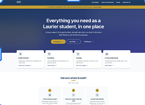
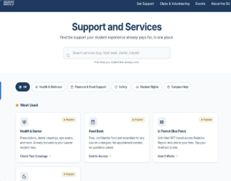
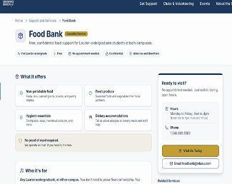
We built a responsive, mobile-first prototype of five core pages, designed for our primary user: time-constrained, mobile-first first-years.
The homepage leads with a headline that says what the SU actually is — "Everything you need as a Laurier student, in one place" — with three CTA cards replacing the cluttered mega-menu. The Service Hub replaced buried navigation with a searchable, categorized page, surfacing the Food Bank, Peer Connect, and tax clinics in a "Most Used" section. Every service detail page opens with an "At a Glance" box: location, hours, eligibility, and a clear next step.
Each of those decisions traces back to one of the two failure points. The homepage solves awareness. The hub and detail pages solve access.
Testing and Handoff
We tested with five first-year students across business, arts, and science, measuring task completion, time on task, wrong clicks, and confidence.
Every participant understood the SU's purpose within five to seven seconds, and every participant found the Food Bank in under three taps. What didn't land was labelling: "Get Involved" confused two participants who couldn't tell whether it meant clubs, volunteering, or events. So we split it into separate pages, renamed "Get Help" to "Support & Services" after students failed to associate help with a food bank, and replaced remaining jargon site-wide.
We delivered five recommendations and a phased handoff plan to the WLUSU web team. The most useful validation wasn't a metric — it was one participant saying "I didn't know the SU offered this much," which is the problem statement, proven in a sentence.